Confused by Colors? Simplifying Your Modern Boho Living Room Palette Choice
Confused by Colors? Simplifying Your Modern Boho Living Room Palette Choice
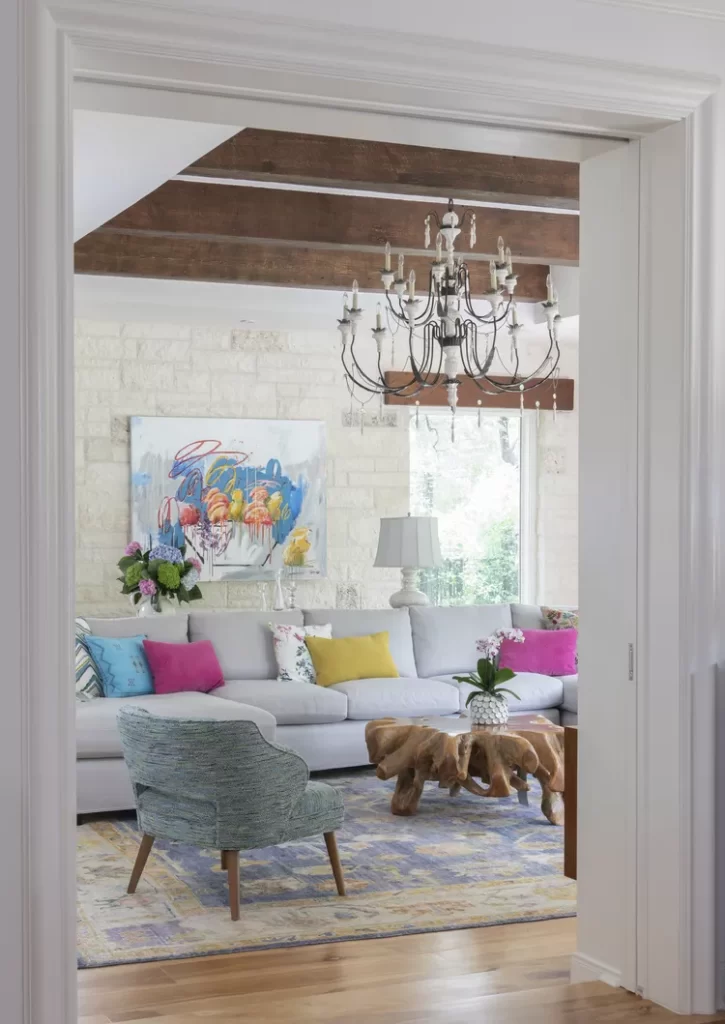
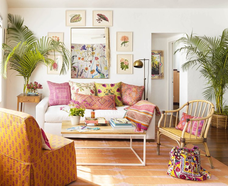
The art of cultivating a bohemian living space lies not in accumulating eclectic pieces, but in orchestrating them into harmony. Perhaps nowhere is this balancing act more delicate than in selecting a color palette that captures bohemian spirit without descending into visual chaos. If you’ve found yourself staring at paint swatches with growing uncertainty or browsing Pinterest until your eyes glaze over, you’re not alone. Let’s demystify the process of choosing a boho color palette that feels authentically you.
The Psychology Behind Boho Palettes
Bohemian style embraces personal expression over passing trends, yet there’s an underlying structure to its seeming randomness. The most successful boho spaces achieve a carefully cultivated casualness—a visual exhale that feels simultaneously energizing and grounding.
The biggest misconception about bohemian style is that it’s unplanned. The truth is quite the opposite. The freedom and relaxation you feel in these spaces comes from thoughtful color choreography.
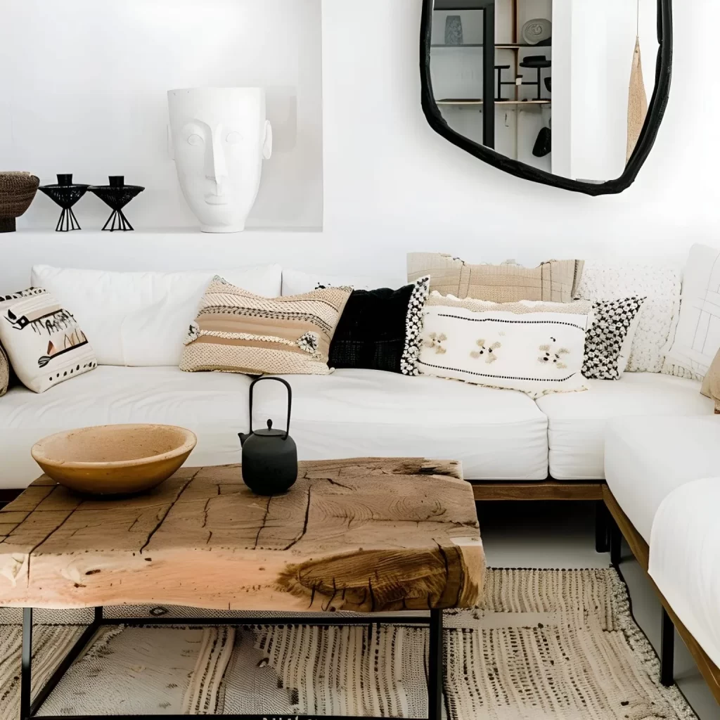
This choreography typically begins with a neutral foundation. Rather than sterile whites, think warm canvas tones that create breathing room—soft oatmeals, gentle ivories, or muted taupes. These quieter notes create negative space that allows your statement pieces to sing rather than shout.
Finding Your Palette’s Personality
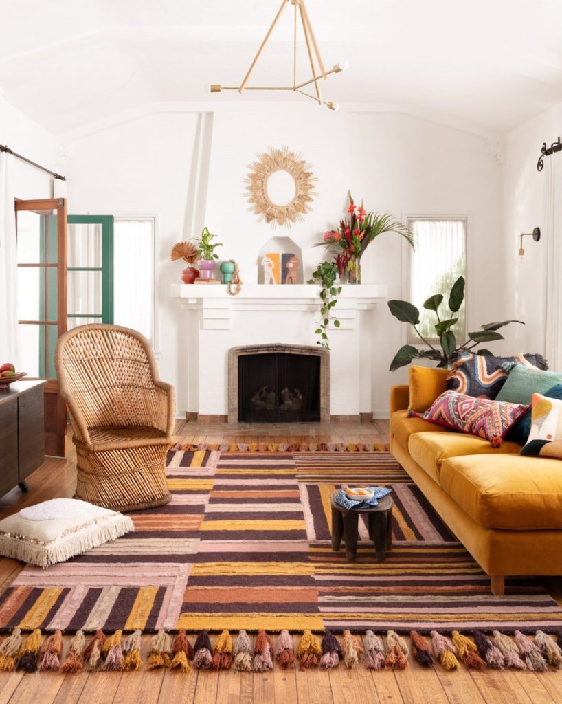
Rather than following rigid rules, consider your boho palette as an extension of your personal energy. Are you drawn to the fiery richness of sunset tones—terracottas, rusts, and burnished golds? Or do you gravitate toward cooler earth connections—sage greens, dusty blues, and lavenders?
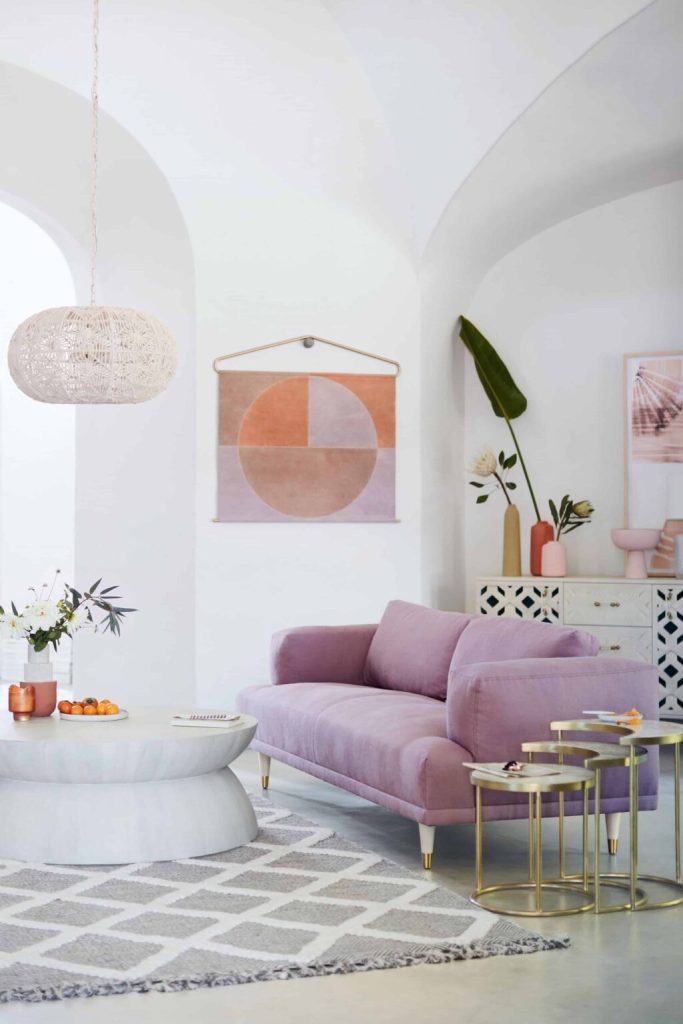
The wisest approach isn’t to choose colors you admire from a distance, but colors that resonate with you viscerally. Take inventory of your existing treasures—the textiles, artwork, or travel souvenirs you’re naturally drawn to collect. What color threads connect these pieces? This archaeological dig through your own taste often reveals the palette that’s been waiting for you all along.
The Rule of Three (Plus Two)
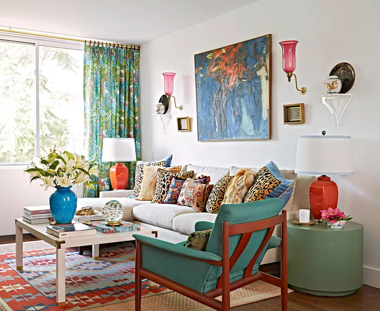
To avoid the common pitfall of palette overwhelm, embrace the Rule of Three Plus Two: three primary colors that dominate your space, plus two accent colors that appear more sparingly.
For your primary colors, consider:
- Your neutral foundation (cream, taupe, warm gray)
- Your dominant midtone (terracotta, olive, indigo)
- Your statement color (mustard, peacock blue, plum)
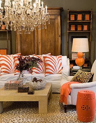
Your accent colors should appear as thoughtful punctuation marks rather than full paragraphs in your space—perhaps in the tassels of a throw pillow, the detail of a vintage rug, or a single spectacular ceramic piece.
The Natural Harmony Shortcut
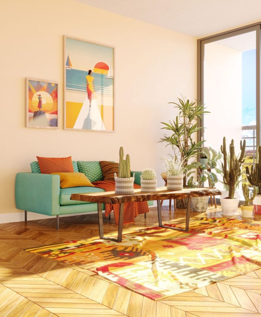
When palette paralysis strikes, the natural world offers ready-made combinations that inherently please the eye. Consider borrowing palettes from:
Desert landscapes with their sun-bleached neutrals, clay tones, and surprising bursts of cactus green and sunset pink.
Coastal scenes that pair weathered driftwood grays with ocean blues, sea glass greens, and shell pinks.
Forest floors with their rich mushroom browns, moss greens, bark tones, and unexpected berry brights.
These nature-inspired combinations provide visual coherence while maintaining the collected-over-time essence that defines bohemian style.
Beyond Color: Texture as the Unsung Hero
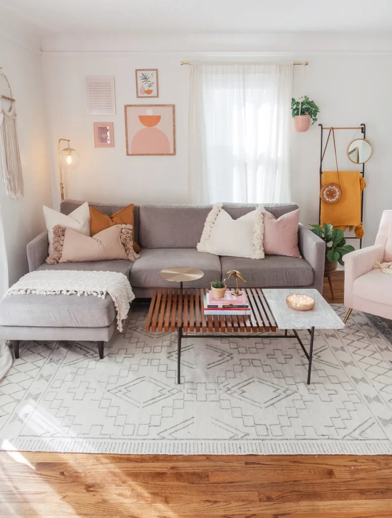
The secret ingredient in successful boho spaces isn’t just color—it’s texture. When working with a more limited palette, textural variety becomes even more crucial. The interplay of rough and smooth, matte and glossy, creates depth that keeps simplified color schemes from falling flat.
Consider how rattan, macramé, velvet, and weathered woods can coexist within the same color family while creating visual interest through their textural conversation. This approach allows you to maintain palette discipline while still achieving the layered richness that defines boho spaces.
Putting Theory Into Practice: The Testing Phase
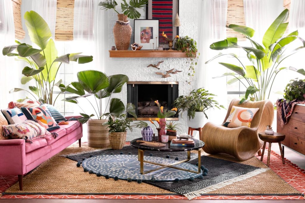
Before committing to your palette, test it in your actual space. Light changes everything, and colors that appear harmonious in a store or on a screen may read differently in your home’s unique light conditions.
Create a mood board with physical swatches, or use the increasingly sophisticated AR tools offered by paint companies and home retailers to visualize your palette in situ. Pay attention to how the colors shift throughout the day, from morning brightness to evening warmth.
Permission to Evolve
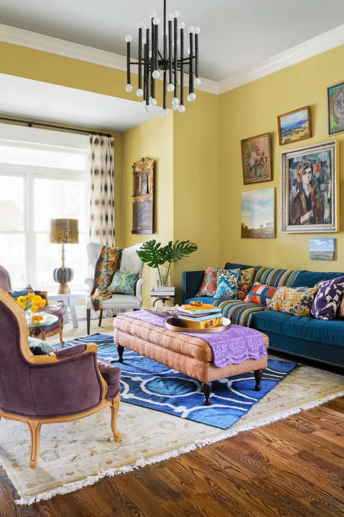
Perhaps the most liberating aspect of bohemian style is its inherent openness to evolution. Your palette need not be permanently fixed—it can breathe and grow alongside you.
Begin with your foundation colors, then allow accent colors to emerge organically as you discover new pieces that speak to you. This slow-decoration approach honors the bohemian ethos of authenticity over instant perfection.
True boho spaces tell the story of their inhabitants. The most beautiful palettes are those that remain open to new chapters.
In embracing a thoughtful approach to color, you free yourself from the anxiety of getting it “wrong.” Instead, you create a living canvas that celebrates intentional imperfection—the very essence of bohemian style. Your perfect palette isn’t waiting to be discovered in a magazine; it’s already emerging in the colors that surround you when you feel most at home in your skin.
