Fearlessly Pink: A Masterclass in Color Confidence

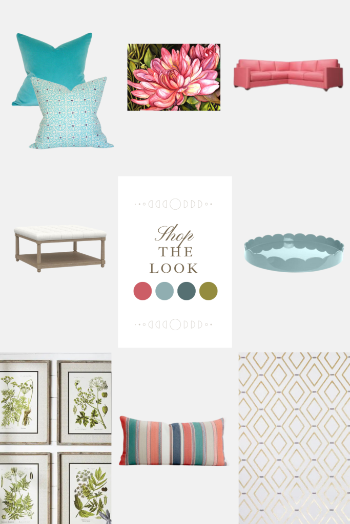
Scroll Down for Sources
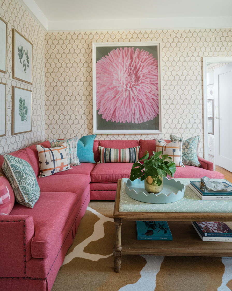
When people say they’re afraid to use bold colors, point them to rooms like this one – a masterful demonstration of how to embrace a statement shade while maintaining sophistication and balance. This space proves that pink isn’t just for nurseries; it can be the foundation of a refined, adult living room that exudes both personality and polish.
The success of this design lies in its thoughtful layering. The pink sectional sofa makes an unmistakable statement, but notice how it’s grounded by the neutral cow-patterned rug beneath. The wallpaper – a delicate gold lattice pattern on cream – provides subtle texture without competing with the room’s bold elements. This is a crucial design lesson: when using a strong color, balance it with neutrals that can hold their own without overwhelming.
The large-scale pink flower artwork above the sofa is a brilliant choice. Instead of shying away from the pink theme, it embraces it, but in a sophisticated, artistic way. The oversized scale and photographic style elevate it beyond mere decoration to a true focal point. For those looking to recreate this effect, remember that artwork doesn’t need to contrast with your color scheme – sometimes amplifying your chosen hue can create powerful impact.
The room’s secondary color story deserves attention: aqua blue accents appear in the pillows and decorative accessories, creating a fresh, contemporary palette. This combination prevents the pink from feeling too sweet or precious. When working with pink, consider unexpected color pairings – here, the aqua adds a cool, refreshing note that balances the warmth of the pink.
Texture plays a crucial role in the room’s success. The linen-like fabric of the sofa, the subtle sheen of the wallpaper, the organic elements like the potted plant, and the weathered wood of the coffee table create depth and interest. For those hoping to recreate this look, remember that varying textures can make a monochromatic or limited color palette feel rich and nuanced.
The styling of the coffee table offers a lesson in restraint – a simple tray holding a plant, a few carefully chosen books, and minimal accessories. This disciplined approach to decorative elements prevents the room from feeling busy, allowing the bold color choices to shine.
What makes this room particularly successful is its commitment to its vision while maintaining livability. The sectional appears comfortable and inviting, the coffee table provides ample space for books and beverages, and the overall arrangement encourages conversation. It’s a reminder that statement-making rooms can still be functional, comfortable spaces.
For homeowners inspired by this space, here’s the key takeaway: successful bold color use requires balance. Start with your statement piece (here, the pink sofa), then build layers of support through neutrals (the wallpaper and rug), complementary colors (the aqua accents), and varying textures. Don’t be afraid to double down on your chosen color through artwork or accessories, but keep the overall styling clean and purposeful.
This room feels joyful yet sophisticated, bold yet welcoming. It challenges the notion that neutral spaces are the only way to achieve elegance in interior design. By following its example – thoughtful color balance, textural variety, and disciplined styling – you can create a space that’s both dramatically colorful and thoroughly livable.

sources
Pillow 1, Pillow 2 | Artwork | Sectional
Coffee Table | Tray
Botanical Prints | Pillow | Wallpaper
