
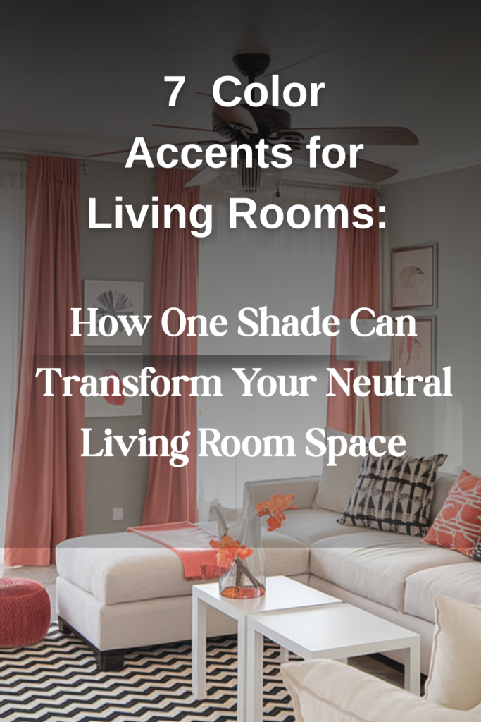
The Color Catalyst: How One Shade Can Transform Your Neutral Living Room Space
There’s something undeniably appealing about a neutral living room—it’s timeless, versatile, and creates a sense of calm in our chaotic lives. But let’s be honest: sometimes “neutral” can veer dangerously close to “forgettable.” The good news? You don’t need a complete overhaul to breathe life into your beige, gray, or white sanctuary. One thoughtfully chosen color is all it takes to transform your space from subtle to stunning.
The Psychology Behind Your Perfect Accent
Before diving into a sea of swatches, consider what you want your living room to accomplish. Are you seeking a retreat for relaxation, a vibrant space for entertaining, or perhaps a balance of both? Color psychologists have found that our environments significantly impact our mood and energy levels—with 72% of homeowners reporting greater satisfaction in spaces featuring intentional color choices.
“The right accent color doesn’t compete with neutrals—it completes them,” explains interior designer Mara Jenkins. “It’s about finding that perfect shade that speaks to both your space and your personality.”
Choosing Your Color Catalyst
The beauty of starting with a neutral backdrop is its versatility. Like a chameleon, it can adapt to nearly any color companion. Here’s how to find your perfect match:
For Serene Sophistication: Teal
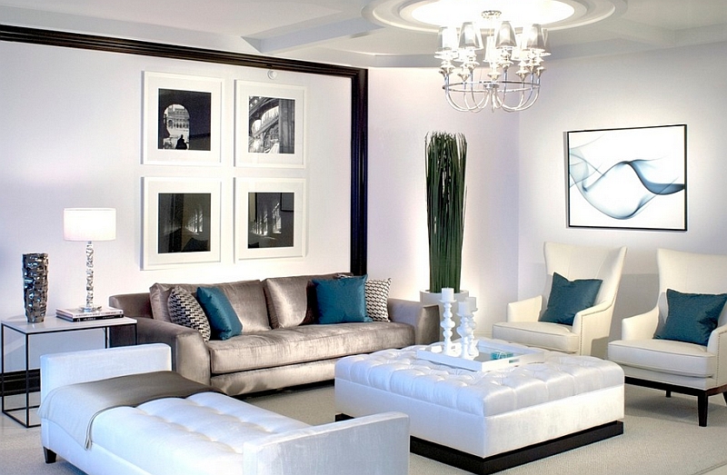
Few colors offer the depth and versatility of teal. Reminiscent of ocean depths and tropical waters, this blue-green hybrid brings instant sophistication to cream, beige, or gray settings. What makes teal particularly special is its chameleon-like quality—it feels cool and refreshing in summer months while offering rich coziness during winter.
Consider an oversized velvet teal armchair as your room’s anchor piece, or layer teal cushions in varying textures against a neutral sofa. For the bold, a teal accent wall behind floating shelves creates dramatic depth without overwhelming the senses.
For Energetic Elegance: Coral
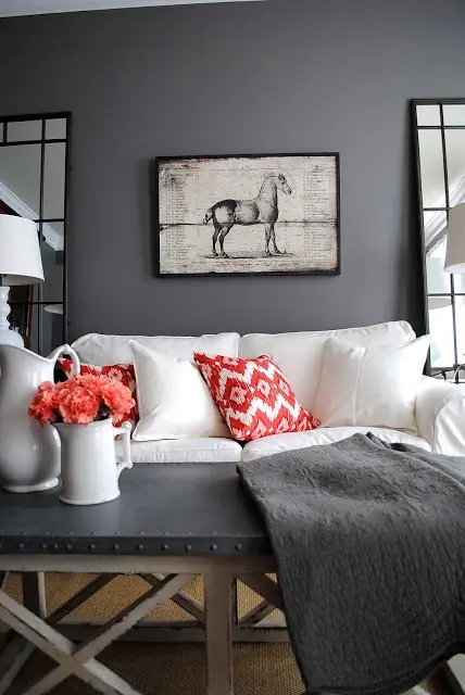
Coral offers the perfect marriage of warmth and vivacity—bringing the energy of orange and the softness of pink. When introduced to a neutral backdrop, it instantly creates a welcoming atmosphere that feels both sophisticated and spirited.
Try coral in unexpected places: a textured throw draped casually across an ottoman, ceramic lamps flanking a console table, or framed textile art that incorporates coral alongside your existing neutral palette. The key is balance—coral demands attention, so use it judiciously.
For Grounded Glamour: Earthy Green
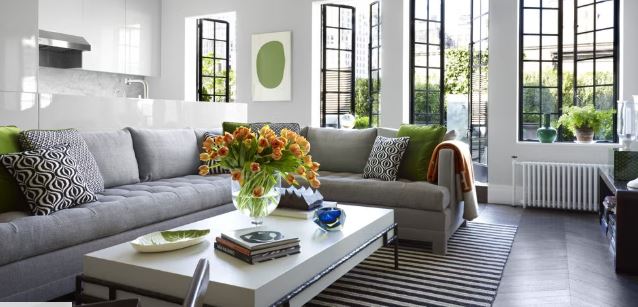
There’s a reason biophilic design has gained such momentum—our connection to nature runs deep. Shades of olive, sage, and emerald bring the outdoors in while adding depth and character to neutral spaces. Unlike trendier colors, greens have staying power, making them a wise investment for your design dollars.
Beyond the obvious addition of plants (though they’re always a good idea), consider green in velvet cushions, a statement rug, or even smaller accents like ceramic vases and bookends. The result is a space that feels simultaneously refreshed and rooted.
For Timeless Luxury: Burnished Gold
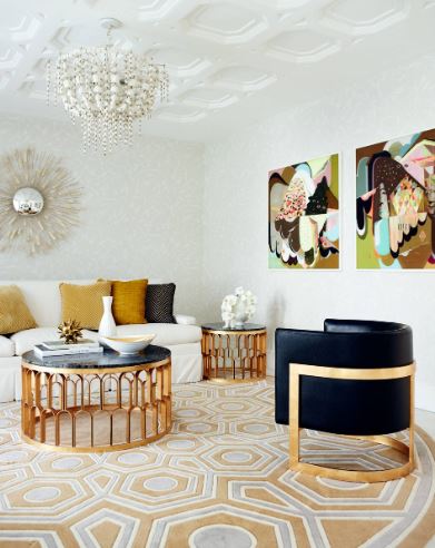
There’s something inherently luxurious about gold tones—they elevate even the most modest spaces without trying too hard. The key is choosing burnished, antiqued finishes rather than bright, shiny variations that can quickly feel dated or gaudy.
Gold-framed mirrors expand your space while adding warmth; vintage brass lamps create ambient lighting with character; and gold-leafed artwork introduces texture alongside color. Even small touches—like replacing standard hardware on cabinets or investing in brass candlesticks—can profoundly impact your room’s overall feeling.
For Sunshine Warmth: Vibrant Yellow
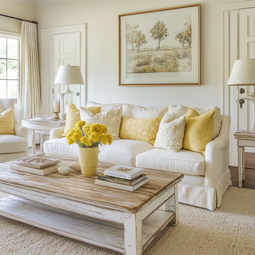
Yellow is the color of optimism and clarity—perfect for spaces that need an infusion of energy. When thoughtfully incorporated into a neutral palette, yellow creates an effect that’s both uplifting and sophisticated.
The trick with yellow is choosing the right tone for your space. Butter yellows complement warm neutrals like beige and cream, while citron shades create striking contrast against cooler grays. Consider a yellow accent chair, textured throw, or collection of ceramic vessels grouped on a coffee table. For art lovers, abstract paintings featuring yellow elements can anchor a room without overwhelming it. Studies suggest that yellow stimulates mental activity and conversation—making it particularly well-suited for living areas where guests gather.
For Bold Definition: Strategic Black
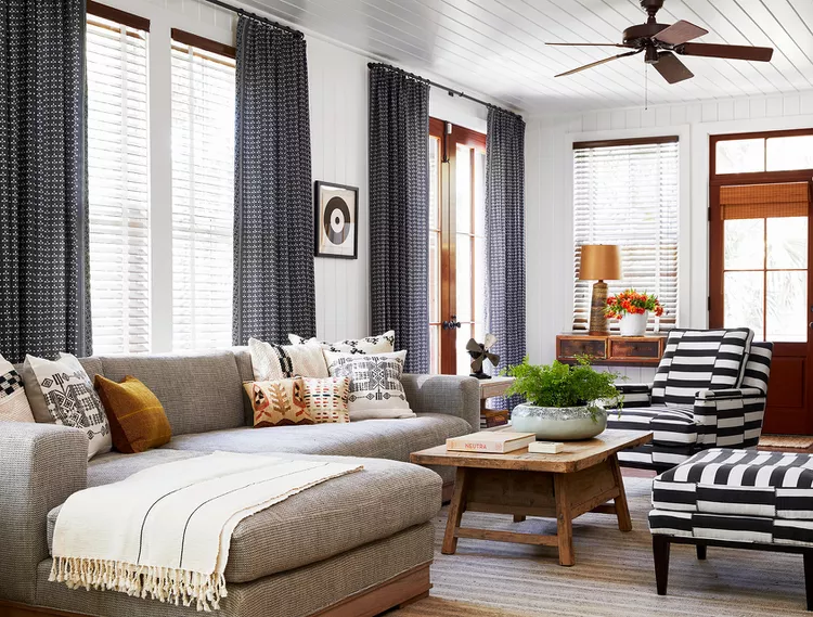
Black might seem counterintuitive when trying to enliven a space, but its judicious use can define and elevate a neutral room like nothing else. When used as an accent, black creates architectural interest and visual punctuation that makes everything around it appear more deliberate.
Consider matte black picture frames creating a gallery wall against a soft white background, or sleek black metal lighting fixtures that draw the eye upward. A black console table or coffee table with clean lines provides a sophisticated anchor, particularly when paired with natural textures. The secret is using black sparingly and purposefully—too much can feel heavy, but the right amount provides necessary contrast that makes everything else in the room shine.
For Passionate Energy: Refined Red
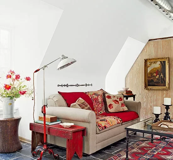
Few colors make a statement quite like red. This powerhouse hue brings immediate warmth and energy to neutral spaces, creating focal points that command attention without saying a word. The key is finding the particular red that resonates with your existing neutrals—brick and terracotta reds for warmer beiges, cherry and crimson for cooler whites and grays.
Rather than overwhelming your space, try red in concentrated doses—a pair of table lamps, a single statement chair, or textured cushions in various shades of the same red family. Vintage rugs incorporating red alongside neutral patterns provide grounding energy, while contemporary art featuring red creates compelling focal points. Psychologists note that red stimulates conversation and appetite, making it particularly effective in living spaces connected to dining areas.
The Art of Intentional Integration
Once you’ve selected your signature shade, the real artistry begins. Here’s how to integrate your chosen color with purpose and restraint:
Follow the Rule of Three
Design professionals often recommend the “rule of three”—incorporating your accent color in at least three places throughout the room for cohesion without overwhelming. These touchpoints can vary dramatically in size, from a substantial area rug to tiny drawer pulls.
Consider Your Color’s Temperature
Warm colors (coral, gold, amber) naturally advance, making spaces feel cozier and more intimate. Cool colors (teal, emerald, slate) recede, creating a sense of expansiveness. Use this knowledge strategically—cool tones can make a small room feel more spacious, while warm accents bring intimacy to larger areas.
Play with Pattern and Texture
Your accent color gains dimension when explored through varying textures and patterns. A solid teal velvet cushion takes on new life when paired with a geometric teal-and-white throw or a watercolor-inspired teal art piece. This variation prevents your accent from feeling flat or one-dimensional.
Seasonal Adaptability: One Room, Many Moods
Perhaps the greatest advantage of a neutral foundation is its adaptability. With minimal investment, you can refresh your space seasonally:
- Spring/Summer: Lighten teal accents with additional whites and natural textures like rattan and linen
- Fall/Winter: Deepen teal with complementary copper and chocolate brown accessories
The same principle applies regardless of your chosen accent color—shift its companions seasonally while maintaining your signature shade for a space that evolves without requiring a complete redesign.
Finding Your Perfect Match
When hunting for your color catalyst, bring fabric swatches, paint chips, or digital images of your neutral space with you while shopping. The most successful accents complement the specific undertones in your existing neutrals—warm beiges pair beautifully with terracotta and gold, while cooler grays harmonize with teal and emerald.
Remember that lighting dramatically affects how we perceive color. Test potential accents in your actual space during different times of day before committing to larger pieces or paint.
Your neutral living room isn’t a design limitation—it’s an opportunity. With one thoughtfully chosen color as your catalyst, that blank canvas transforms into a personalized sanctuary that’s anything but boring. The result? A space that feels curated rather than decorated, timeless rather than trendy, and—most importantly—authentically yours.